

Gearlab
UI/UX Prototype


A prototype inspired from MCOC for selecting, upgrading, and customizing sports gear built in Adobe XD.
GEARLAB

PROTOTYPE WALKTHROUGH
Project Duration
Role
Software

All fun and clicks until… wait, what am I doing?
1 Month
UI/UX Designer
Adobe XD, Illustrator


INTRODUCTION
GearLab is a wireframe prototype I created to explore how players might customize and craft sports equipment through a clean interface. I took inspiration from the intuitive UI of Marvel Contest of Champions and brought it to life using Adobe XD for the design and used Adobe Illustrator for all the custom icons.
The process was hands-on from start to finish:
-
Created a Strategy guide
-
Created a User Persona
-
Developed a Test Plan and Report
-
Designed a User Flow and Architectural Map
-
Created a UI/UX Style Guide
-
Finally, Crafted the Wireframe
DOCUMENTATION AND PLANNING
1. UI/UX Strategy Guide

The UI/UX Strategy Guide for Gear Lab outlines the foundational vision for the game’s design, focusing on crafting an engaging mobile experience that blends sports gear customization with business management mechanics. It defines the game's core goals, player personas, key features, and market differentiators, while also addressing challenges like balancing realism with accessibility. Through competitor analysis, KPI planning, and a clear understanding of player motivations, the guide shaped a focused direction for creating intuitive systems, meaningful progression, and long-term player engagement.
2. User Persona
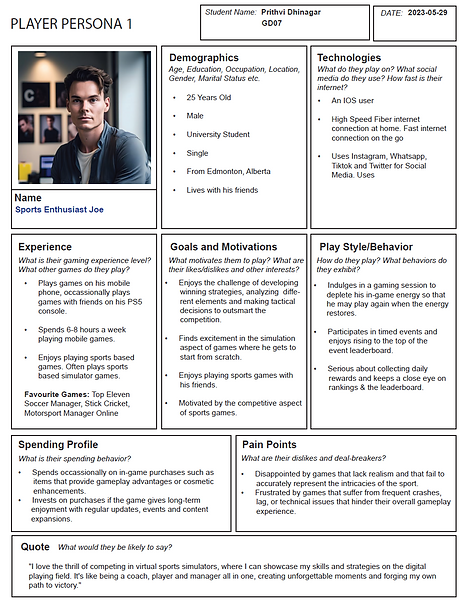
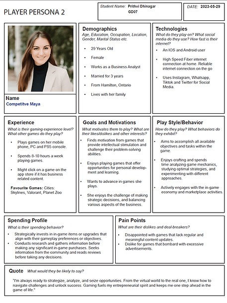
For my prototype, I’ve created two distinct user personas —
-
Sports Enthusiast Joe
-
Competitive Maya
These personas represent the two main types of players I designed the experience for.
-
Joe reflects the casual yet committed sports gamer who enjoys simulation-based games, likes competing with friends, and is driven by tactical gameplay and leaderboard progression.
-
On the other hand, Maya represents a more analytical, goal-driven player who seeks games that offer depth, strategic decision-making, and long-term engagement.
Why did I create user personas for this prototype?
User personas help me better understand my potential audience. By identifying who they are, what motivates them, and how they interact with games, I can design a more targeted and engaging experience.
Why did I choose these two types of players?
They represent two common types of users who would engage with the kind of sports equipment crafting and management system this prototype is based on. Joe’s persona covers the fun, fast-paced simulation aspect, while Maya’s reflects players who enjoy strategy, crafting, and in-depth systems.
How did these personas influence my design decisions?
They helped me prioritize features like a clean and intuitive UI, a leaderboard and item customization. For Joe, I made sure the experience was smooth. For Maya, I added layers of information and decision-making options.
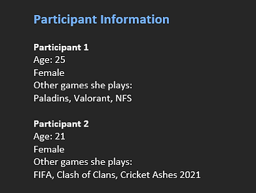
3. Usability Test Plan & Report
Usability Test Plan
This document outlines how I prepared to test the GearLab prototype. It includes the test goals, participant profiles, tasks they were asked to perform, and the script I used during the session.

Usability Test Report
This report captures the results of the usability test. It includes what worked, what didn’t, participant feedback, and suggestions for improving the user experience.

4. User Flow: Core Gameplay Loop

The user flow illustrates the player's journey through the core gameplay loop of Gear Lab, differentiating between new and returning users, while showcasing the key screens, decision points, and gameplay outcomes.
Entry Points
-
New Player begins with FTUE (First Time User Experience) to get familiar with the game mechanics.
-
Returning Player lands directly on the Home Screen.
Main Navigation
-
From the Home Screen, players can choose to:
Play Game
Quit Game
Gameplay Flow
-
Tapping Play Game leads to the Main Game Screen, where players interact with gameplay elements, likely crafting and selling sports gear.
-
During the game, an Athlete Feedback / Expectations Display appears as an overlay, guiding the user.
Win/Loss Conditions
-
After the main game:
WIN ➜ Win Screen ➜ End Screen ➜ Rewards
LOSS ➜ End Screen ➜ Rewards
Post-Game Options
-
Rewards can lead to:
Update Profile/ Crafting to improve gear and customize.
Go Home, which sends users back to the Home Screen.
Update Ranking/Leaderboard reflecting player progression and competition.
Crafting Overlay
-
The players craft items using Tokens and Crafting Equipment, resulting in new Sports Gear.

5. Information Architecture Map
The architecture map provides a hierarchical structure of the game’s key systems and navigation, giving insight into the available features and content.
Initial User Flow
-
Loading Screen: Displays the logo, terms, tips, and loading status.
-
Login/Register: Users can log in with Google/Apple or register via email.
-
FTUE: Onboarding experience for new users.
Home Screen Features
-
Displays HUD with:
Player Currency, Name, Energy, and Level
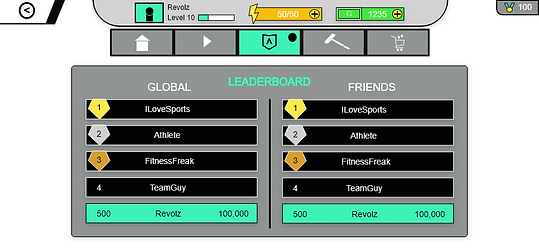
Navigation to: Play Game, Info, Leaderboard & Ranking
Main Menu Options
-
Settings - Access to privacy policy, terms, FAQ, language, graphics and audio settings.
-
Leaderboard - Displays player level, global ranking, friend comparisons, and achievements.
-
Store - Buy in-game currency, crafting equipment, special offers and Customization tokens.
-
Customize/Craft - Craft gears using tokens ➜ Select equipment and develop gears ➜ Get Athlete feedback.
-
Email/Global Chat - Global/Friends chat for social interaction.
-
Sell Gears - Main Gameplay Screen where players meet user requirements and sell crafted gear.
Post-Game Screens
-
Win Screen:
Replay, check rewards, and return to the menu
Offers more rewards and crafting opportunities
-
Loss Screen:
Replay, check score, but receive fewer rewards
-
Success Rewards:
In-Game Cash, XP, Customization tokens
Rare chance of receiving crafting equipment
Text overload? Just making sure you’re awake.


6. UI/UX Style Guide
Gearlab's UI/UX Style is vibrant and mythical. The UI incorporates stylized illustrations that are fun and easy to read.
-
Clean, Vibrant
-
Sharp, Bevelled buttons
-
Vibrant colours
-
Easy-to-read & simple fonts
-
Stylized and creative icons

Use white icons and text inside the buttons
Buttons
Always use:
-
Sharp corners
-
Bevel
-
Drop shadow


Icons
Always use:
-
Clear and stylized shapes
-
Bevel
-
Drop shadow
-
Vibrant colours
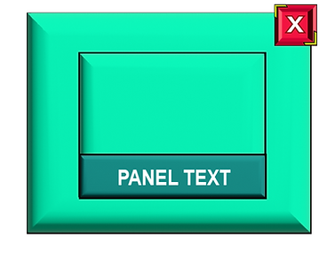
Pop-Up Panels
-
Light Green panel with bevel, shadows and stroke.
-
Always have the close button in the top right.
-
Black title text.
-
Another cyan panel that shows icons and text inside.
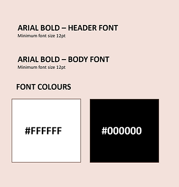
Fonts
-
The main text must always be at a larger size and bold.
-
The normal big paragraphs must be in a medium readable size.
-
Font colours must be basic colours such as white or black.
Colours
Always use:
-
Vibrant colours for icons.
-
General colours for backgrounds and panels.
7. User Feedback and Changes


During multiple user test sessions, players shared key insights that helped improve usability and engagement:
-
Some screens were too cluttered or lacked a clear hierarchy
-
Crafting feedback wasn't immediately visible
-
Players felt unclear about the current progress or how to proceed.
Screen Mockups
 |  |  |
|---|---|---|
 |  |  |
 |  |  |
 |  |  |
 |  |  |
 |  |  |
Explore

Gear Lab allowed me to apply my design skills, from wireframing to user testing and crafting a game interface that’s both functional and fun.
Try Now